Flutter에서 hero animation은 다른 페이지로 이동 할 때 두 페이지 간의 공통되는 widget(대표적으로 이미지)이 화면에서 사라지지 않고 자연스럽게 시작 페이지에서 목표 페이지로 넘어가는 듯한 효과를 주는 애니메이션입니다.
일반적으로는 shared element transitions(animations)으로 알려져있습니다.
Hero를 이해하기 전에 알아두면 좋은 Flutter animation library의 핵심 widget들
-
시작 값과 끝 값만을 파라미터로 받는 stateless widget. Tween은 단지 입력값을 원하는 출력값으로 변환해주는 역할입니다.
예시
basicTween = Tween<double>(begin: 0.0, end: 1.0);
rTween = Tween<double>(begin: 0, end: 255.0);
...-
vsync object를 필수적으로 파라미터로 넘겨주어야 합니다. 이를 위해 일반적으로는 SingleTickerProviderStateMixin 과 같은 클래스를 사용합니다.
Tween이 매 프레임 만들어낼 때 마다 setState를 호출하여 화면을 갱신하는 식으로 애니메이션을 진행시킬 수 있습니다.
예시
class _LogoAppState extends State<LogoApp> with SingleTickerProviderStateMixin {
late Animation<double> animation;
late AnimationController controller;
final Tween<double> sizeTween = Tween<double>(begin: 0, end: 300);
void initState() {
super.initState();
controller = AnimationController(vsync: this);
animation = sizeTween.animate(controller)..addListener((){setState({})});
controller.forward();
}
void dispose() {
controller.dispose();
super.dispose();
}
Widget build() {
return Center(
child: Container(
width: animation.value,
height: animation.value,
child: const FlutterLogo(),
),
);
}
}
-
Tween과 AnimationController를 이용하면 굉장히 explicit한 애니메이션 코드를 구현할 수 있습니다.
하지만 애니메이션과 관련된 코드가 UI코드와 결합되기 때문에 코드의 복잡도가 올라가 가독성과 유지보수성이 떨어질 수 있습니다.
이를 위해 UI와 애니메이션을 분리할 수 있게 도와주는 것이 AnimatedWidget입니다.
UI는 그대로 그리고 외부에서 animation을 파라미터로 받아와서 사용하면 되는 식입니다.
예시
class AnimatedLogo extends AnimatedWidget {
const AnimatedLogo({super.key, required Animation<double> animation}): super(listenable: animation);
Widget build(BuildContext context) {
final animation = listenable as Animation<double>;
return Center(
child: Container(
margin: const EdgeInsets.symmetric(vertical: 10),
height: animation.value,
width: animation.value,
child: const FlutterLogo(),
)
)
}
}-
AnimatedBuilder는 애니메이션이 필요한 부분을 다른 widget tree 중간에 넣어서 사용할 필요가 있을 때 사용하면 위젯입니다.
AnimatedWidget이 animation과 UI를 분리했듯 AnimatedBuilder는 UI, animation, transition을 분리하여 사용할 수 있도록 도와줍니다.
Hero animation의 원리
Hero widget이 화면 전환 애니메이션을 구현하는 원리는 다음과 같습니다.
- 시작 화면과 도착 화면에서 사용될 hero widget을 정의합니다. 두 페이지간의 hero widget은 동일한 tag를 가져야 하며 tag가 다른 hero widget들과 중복 되어서는 안됩니다.
- 시작 화면에서 도착 화면으로 가는 함수가 호출이 되는 경우(Navigator.of(context).push와 같은) 전환 애니메이션을 실행시키기 위해 도착지점에 대한 정보를 계산합니다(도착 지점 Hero의 사이즈, layout등).
- 위에서 계산된 도착 지점의 hero를 Overlay의 시작 지점의 hero가 있던 동일한 위치와 사이즈에 배치합니다. Overlay에 배치된 hero는 전환 시에 항상 화면에 표시되도록 Z축값이 변경됩니다. (참고로 Overlay는 Navigator가 관리하는 widget입니다.)
- 시작 지점의 hero를 화면에서 보이지 않도록 화면밖으로 이동됩니다.
- 화면 전환 애니메이션이 시작됩니다. 전환 시 그려지는 애니메이션은
Tween<Rect>를 이용해 그려지며 Hero의 createRectTween을 이용해 해당 애니메이션을 변경할 수 있습니다. 기본값은 MaterialRectArcTween입니다. - 애니메이션이 완료되면 도착 지점의 hero는 Overlay에서 도착 지점 페이지로 옮겨집니다.
- 시작 지점이 화면 밖(offscreen) 에서 route stack에 복구됩니다.
구체적인 예시
저는 위와 같은 hero animation의 원리를 모르고 animation이 예상대로 동작하지 않는 문제를 가지고 하루 정도를 고민해본 경험이 있습니다.
저의 상황은 다음과 같았습니다.
이미지의 개수에 따라 서로 다른 layout과 border radius를 갖게 하기 위해 이미지의 개수(1개 ~ 5개)에 따라서 다음과 같은 별도의 함수를 정의하여 사용했습니다.
/// Simply return a single image tile returned from buildImageTile.
/// width and height are just same with the parent.
/// In this case, Source Hero's image and destination Hero's image has the same
/// size, making super natural transition between two routes.
Widget _buildSingleImage(double width, double height, context){
	return _buildImageTile(
		index: 0,
		width: width,
		height: height,
		total: 1,
		context: context,
	);
}

Widget _buildTwoImages(double width, double height, context){
	return Row(
		spacing: 2,
		children: [
			Expanded(
				child:
				_buildImageTile(
					index: 0,
					width: width / 2,
					height: height,
					total: 2,
					context: context,
				),
			),
			Expanded(
				child:
				_buildImageTile(
					index: 1,
					width: width / 2,
					height: height,
					total: 2,
					context: context,
				),
			),
		]
	);
}
...
Widget _buildThreeImages(double width, double height, context){...}
Widget _buildFourImages(double width, double height, context){...}
Widget _buildFiveImages(double width, double height, context){...}
개별 이미지는 위에 정의된 별도의 함수로부터 width와 height를 전달받아 URLImageTile로 전달합니다.
/// Builds an image tile based on the provided parameters.
Widget _buildImageTile({required int index, required double width, required double height, required int total, required context}){
	final image = images[index];
	BorderRadius? borderRadius =
	    CustomImageWidgetLayout.calculateBorderRadius(total, index);
	return URLImageTile(
	    url: value,
	    onDelete: () => onDelete?.call(index),
	    width: width,
	    height: height,
	    isEditMode: isEditMode,
	    borderRadius: borderRadius,
	  );
}
URLImageTile은 다음과 같이 받아온 width, height를 SizedBox에 넘겨주어 크기를 고정시켜줍니다.
class URLImageTile extends StatelessWidget {
  const URLImageTile({
    super.key,
    required this.url,
    required this.onDelete,
    required this.isEditMode,
    required this.width,
    required this.height,
    this.borderRadius,
  });

	final String url;
	final void Function()? onDelete;
	final bool isEditMode;
	final double width;
	final double height;
	final BorderRadius? borderRadius;

	return SizedBox(
		width: width,
		height: height,
		child: ClipRRect(
		  borderRadius: borderRadius ??
		      const BorderRadius.only(
	        bottomLeft: Radius.zero,
	        bottomRight: Radius.zero,
	        topLeft: Radius.circular(10),
	        topRight: Radius.circular(10),
	      ),
		  child: CachedNetworkImage(
		    imageUrl: url,
		    width: width,
		    height: height,
		    fit: BoxFit.cover,
		    errorWidget: (context, url, error) => const Icon(
		      Icons.broken_image,
		      size: 50,
			),
		  ),
		)
	);
이미지가 1개일 경우에는 문제 없이 정방향, 역방향 애니메이션 모두 자연스럽게 나타납니다.
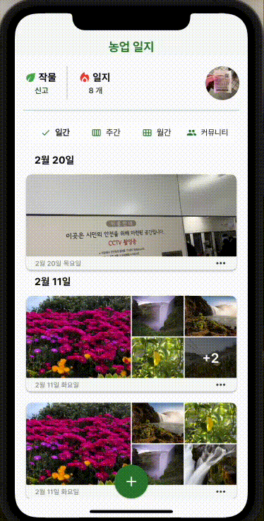
문제는 이미지가 2 개 이상일 경우에는 다음과 같은 현상이 나타납니다.
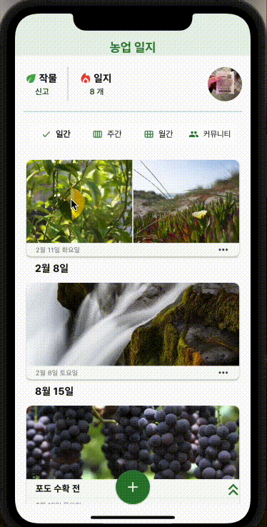
정방향 애니메이션은 자연스럽게 전환이 되지만 역방향 애니메이션은 크기가 갑자기 작아진 상태에서 시작하게 됩니다.
Hero가 애니메이션을 그리는 원리의 3번째 단계를 상기해보겠습니다.
- 위에서 계산된 ”도착 지점의 hero를” Overlay의 시작 지점의 hero가 있던 위치에 시작지점의 hero와 같은 사이즈로 배치합니다. Overlay에 배치된 hero는 전환 시에 항상 화면에 표시되도록 Z축값이 변경됩니다.
Overlay에 배치되는 Hero는 “도착 지점의 Hero” 입니다.
이는 다음 코드와 같이 이미지가 1개 일 때 갖던 width의 절반 만큼만을 최대 사이즈로 갖는 Hero입니다.
따라서 화면에 그려지는 이미지의 사이즈가 순간적으로 작아지면서 애니메이션이 시작하게 되는 것입니다.
/// Now 2 images have to share the width, so each image tile can have half of the width than the single image had.
/// This leads
Widget _buildTwoImages(double width, double height, context){
	return Row(
		spacing: 2,
		children: [
			Expanded(
				child:
				_buildImageTile(
					index: 0,
					width: width / 2,
					height: height,
					total: 2,
					context: context,
				),
			),
			Expanded(
				child:
				_buildImageTile(
					index: 1,
					width: width / 2,
					height: height,
					total: 2,
					context: context,
				),
			),
		]
	);

}
이를 해결하기 위해서는 양 쪽의 Hero가 가질 수 있는 width, height의 값을 동일하게 맞춰줄 필요가 있습니다.
저는 ConstrainedBox를 이용해 이를 구현했습니다.
Fixed Code:
/// Displays network images with caching support via CachedNetworkImage. Shows delete button in edit mode.
class URLImageTile extends StatelessWidget {
const URLImageTile({
super.key,
required this.url,
required this.onDelete,
required this.isEditMode,
required this.maxWidth,
required this.maxHeight,
required this.minWidth,
required this.minHeight,
this.borderRadius,
});
final String url;
final void Function()? onDelete;
final bool isEditMode;
final double maxWidth;
final double maxHeight;
final double minWidth;
final double minHeight;
final BorderRadius? borderRadius;
Widget build(BuildContext context) {
return
ConstrainedBox(
constraints: BoxConstraints(
minHeight: minHeight,
minWidth: minWidth,
maxWidth: maxWidth,
maxHeight: maxHeight,
),
child: ClipRRect(
borderRadius: borderRadius ??
const BorderRadius.only(
bottomLeft: Radius.zero,
bottomRight: Radius.zero,
topLeft: Radius.circular(10),
topRight: Radius.circular(10),
),
child: CachedNetworkImage(
imageUrl: url,
width: maxWidth,
height: maxHeight,
fit: BoxFit.cover,
errorWidget: (context, url, error) => const Icon(
Icons.broken_image,
size: 50,
),
),
),
);
}
}긴 글 읽어주셔서 감사합니다.
Sources
- https://docs.flutter.dev/ui/animations/hero-animations
- https://api.flutter.dev/flutter/widgets/Navigator-class.html
- https://api.flutter.dev/flutter/widgets/Overlay-class.html
- https://api.flutter.dev/flutter/animation/Tween-class.html
- https://api.flutter.dev/flutter/animation/AnimationController-class.html